Shicka Shicka Va Honeytoast
Older sketches of Honeytoast. The standing pose got completely reworked (thank goodness.) The lower left pose, I think, aged well. She used to have heart shaped pupils, but that seemed too gimmicky. There wasn't a real reason for it.
Exploration of facial structure and expressions, also a couple alternate color schemes.

Her original design. The face is pretty much the only thing that changed. The overall design stayed the same.
The preliminary sketch of her pose. I had classic royal portraits in mind when deciding the post. Simple, elegant, and fairly expressionless.
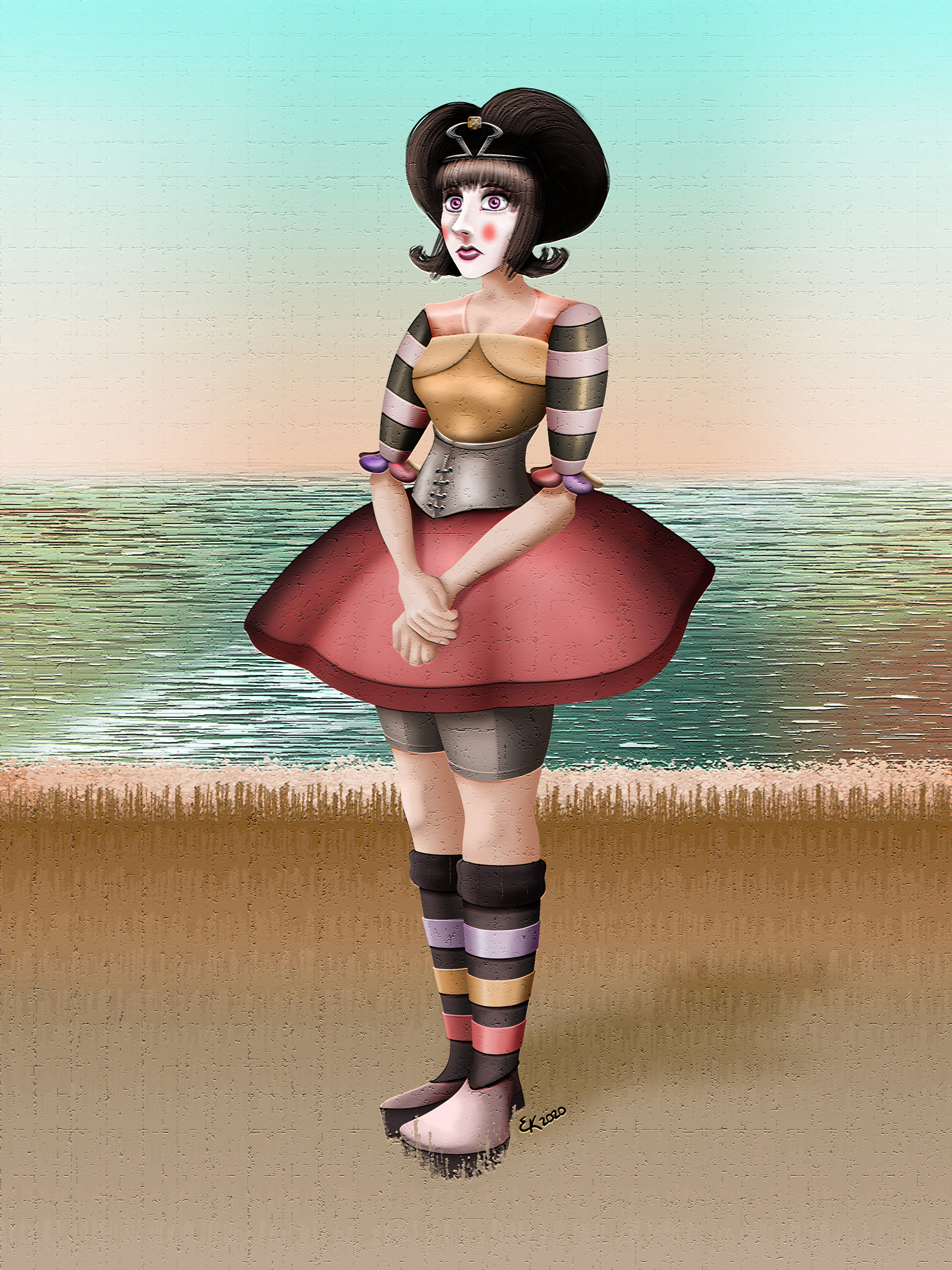
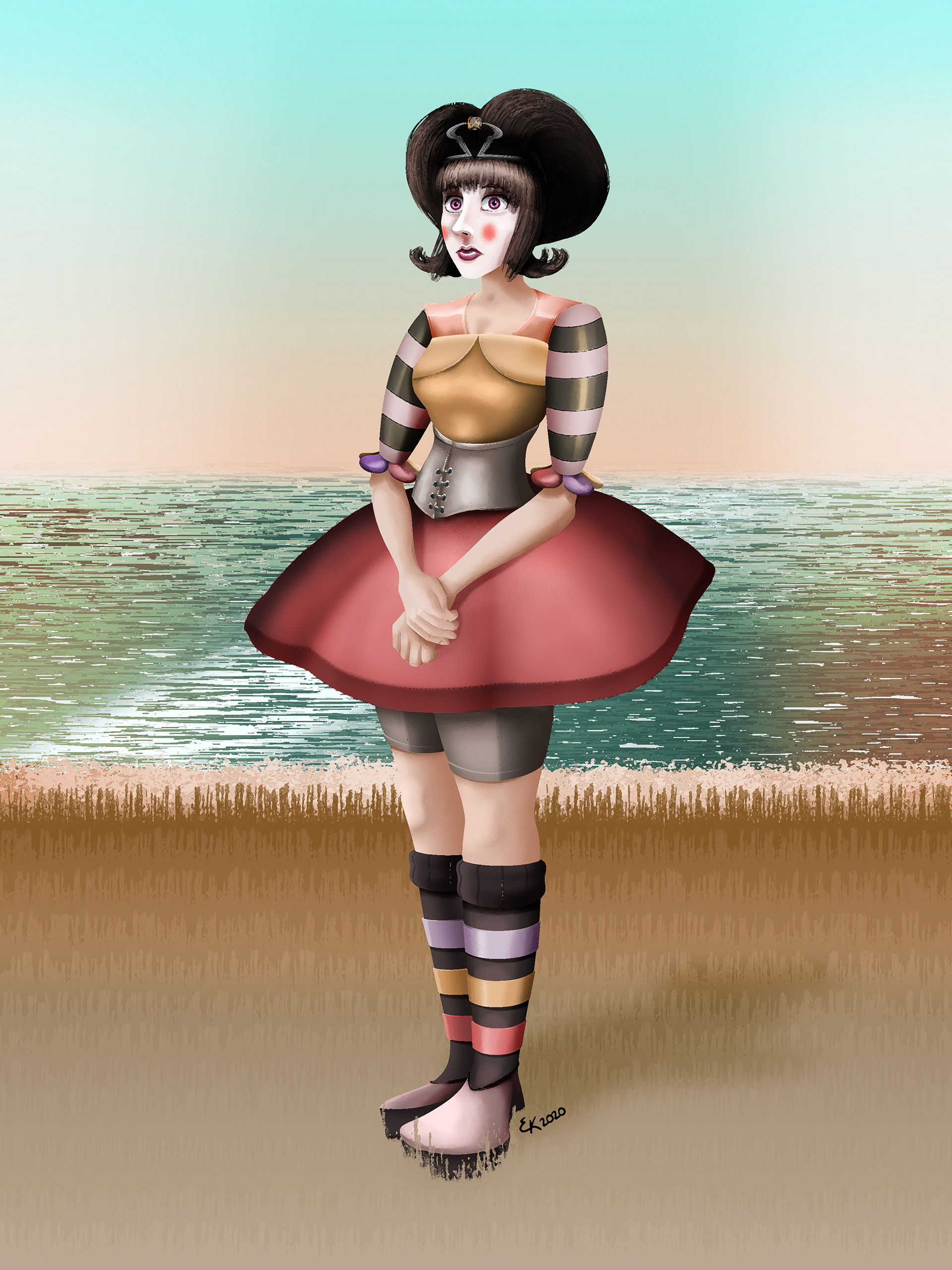
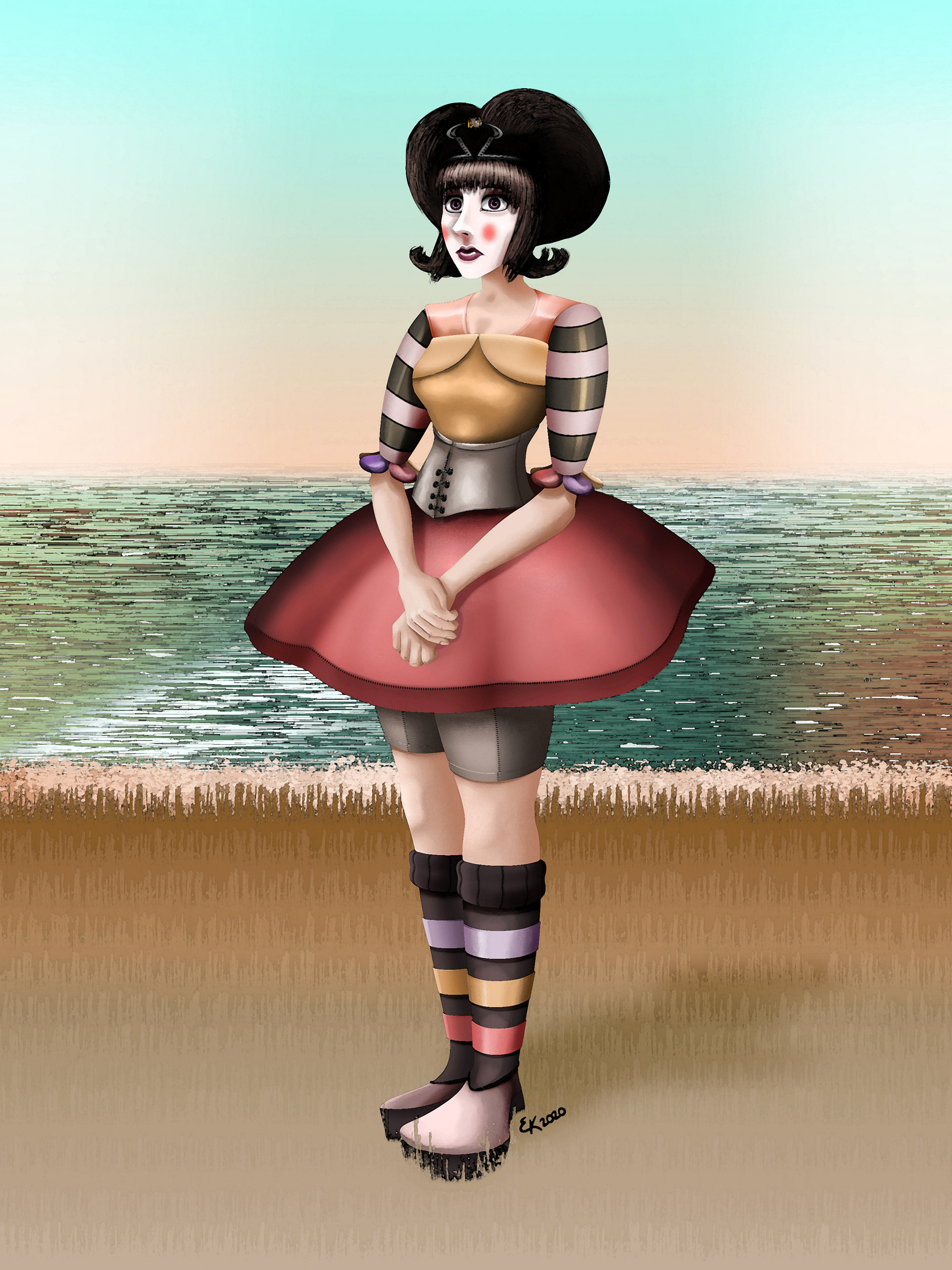
Final render. I decided against the sheer drapery that fell from her skirt in the preliminary sketch because it was not practical and seemed a major inconvenience for her movement.
I wanted to add a colorful background so her character was more cemented in some kind of reality. I like to think this is outside of Honeytoast Castle.
The background


For fun, I put filters over the composition. The original render was drawn from scratch in Photoshop. After I finished, I added different filters to make the image look more like an actual painting. In order, the filters are craquelure, sponge, dry brush, and watercolor.
